Care Gaps Outreach Dashboard
The Care Gaps Outreach Dashboard uses graphics to show your practice's message volume and patient scheduling conversion, so that you can track your practice's performance over time.
On the Main Menu, click Settings ![]() >Communicator. In the left menu,under Practice Links — Care Gaps, click Care Gaps Outreach Dashboard
>Communicator. In the left menu,under Practice Links — Care Gaps, click Care Gaps Outreach Dashboard
To view the Care Gaps Outreach Dashboard, you must have the Communicator Admin permission.
- Display the Care Gaps Outreach Dashboard: On the Main Menu, click Settings
 >Communicator. In the left menu,under Practice Links — Care Gaps, click Care Gaps Outreach Dashboard.
The Dashboard view appears by default and displays two metric cards: AWO: Number of Patients Contacted and AWO: Scheduling Rate. - To see details for one metric, click the metric card on the dashboard.
The Metric Detail view appears.
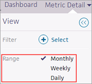
Note: You can also click Metric Detail at the top of the Care Gaps Outreach Dashboard and then select the metric from the menu. - By default, the Metric Detail view shows a 30-day trend on the chart with metric values on the right of the chart. To display a daily trend over the last 30 days, select Daily on the left side of the page. To display a weekly trend, select Weekly on the left side of the page.
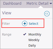
- To filter the metric by care gap, department, or provider, click the plus sign
 (or the Select link) next to Filter on the left side of the page.
A window opens that displays care gaps, department names, and provider names.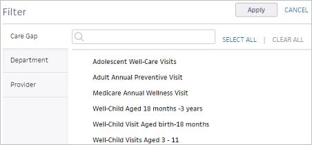
- Select multiple care gaps, providers, or departments to compare AWO data, or select only one care gap, provider, or department for a more detailed analysis of one item.
Note: Selecting one filter option displays the trend for that option; selecting multiple options allows you to compare the performance of your selected options. - Click Apply.
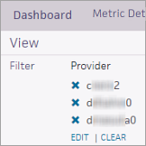
- To remove a filter, click the delete
 icon to the left of the filter or click CLEAR to clear all the filters.
Automated wellness outreach (AWO) provides enhanced population health messaging to athenaOne organizations. AWO uses athenahealth clinical guidelines to identify patients who have care gaps related to wellness visits and automatically contacts a small percentage of these patients each day. In this way, AWO patient messaging is spread out over time, making it easier for you to field patient requests for appointments in response to AWO messages.
Note: To take advantage of automated wellness outreach, your practice must use all three athenaOne products: athenaCollector, athenaClinicals, and athenaCommunicator.
These reporting tools provide insight into your practice's AWO messaging metrics and outcomes:
- The Care Gaps Outreach Dashboard uses graphics to show your practice's message volume and patient scheduling conversion, so that you can track your practice's performance over time.
- The Automated Wellness Outreach report includes detailed information about AWO messages, including patient recipient, care gap, attributing provider, and attributing department, as well as information about appointments scheduled by patients in response to automated wellness outreach messages.
In addition, the Patient Communication Activity report includes Automated Wellness Outreach as one of the services you can report on. This report displays basic information about patient communication activity for all patients at your practice.
Note: You can see the actual text of an AWO email or text message on the Patient Communication Activity page and the Patient Communication History page.
The Care Gaps Outreach Dashboard provides the following metrics.
This metric shows
- Average number of your patients that AWO contacted per day over the last 30 days.
- Change in the 30-day average, since 30 days ago.
This metric shows
- Average percentage of your patients that AWO contacted over the last 30 days who scheduled an appointment within 14 days after AWO contact.
- Change in the 30-day average, since 30 days ago.
On the Dashboard view of the Care Gaps Outreach Dashboard, all metrics appear within a "card." Each card represents your practice-level performance with no filters or sorting applied. Each graph shows the average for the last month.
Each card displays the following information:
- Name of the metric.
- 30-day average, which shows the average number of patients that AWO contacted per day. The 30-day average is color coded.
- Gray text — Performance is within the athenahealth target.
- Red text — Performance is outside the athenahealth target.
- Change — The change value (+/-) and the trend arrow are color coded to indicate whether the change is moving in a favorable or unfavorable direction. If the arrow is red, the change is moving in the wrong direction (an up arrow can be good or bad, as can a down arrow).
On the Dashboard view, you can click a metric card to display the Metric Detail view for each metric.
The Metric Detail view for each metric provides additional options for viewing the performance data. The unfiltered metric visualization shows the 30-day trend for the selected metric. You can hover the cursor over points on the line graph to display performance information at that point in time.
Note: At the top of the Metric Detail view, you can click the information icon ![]() to the right of the metric name to display the definition of the metric.
to the right of the metric name to display the definition of the metric.
Date ranges
On the left side of the Metric Detail view, you can select Monthly, Weekly, or Daily using the Range option (Monthly is the default option).

The default Monthly option shows the 30-day trend on the chart. The Weekly option shows the weekly trend over the last 30 days, and the Daily option shows the daily trend over the last 30 days.
Filter options
On the left side of the Metric Detail view, you can select filter options by clicking the plus sign ![]() (or the Select link) next to Filter.
(or the Select link) next to Filter.
A window opens that displays care gaps, department names, and provider names.
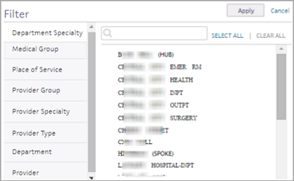
Select multiple care gaps, providers, or departments to compare AWO data, or select only one care gap, provider, or department for a more detailed analysis of one item.
Note: Selecting one filter option displays the trend for that option; selecting multiple options allows you to compare the performance of your selected options.
Chart data
On the right side of the Metric Detail view, you can see the 30-day average and change value.
Export metric data to a table
You can click the Export button at the top right of the page to download the data as a .csv file that you can open in Microsoft Excel. The exported data retains any filters applied to the data.