Sentinel Metrics Dashboard
athenaCollector + athenaClinicals
athenaOne for Hospitals & Health Systems
Important: Starting August 3, 2022, you will no longer be able to access the Sentinel Metrics Dashboard in athenaOne. All metrics previously on the Sentinel Metrics Dashboard are now available within the Insights Dashboards, which provide better performance and more interactive functionality. You can still access the legacy Sentinel Metrics from a link on the homepage of the Insights Dashboards.
The Sentinel Metrics Dashboard allows you to view your performance against important metrics. The supporting data behind each metric is updated nightly.
On the Main Menu, click Reports. Then click Sentinel Metrics Dashboard
To access this page, you must have the Practice Superuser role or the Report: Sentinel Metrics Dashboard permission.
- Display the Sentinel Metrics Dashboard: On the Main Menu, click Reports. Then click Sentinel Metrics Dashboard.
The Dashboard view or the Grid view appears by default. You configure the default view on the Sentinel Metrics Dashboard Settings page.
On the Dashboard view
- To see details for one metric, click the metric card on the dashboard.
The Metric Detail view for the sentinel metric appears.
Note: You can also click Metric Detail at the top of the Sentinel Metrics Dashboard page and select the metric from the menu. - By default, the Metric Detail view shows a 13-month trend on the chart with metric values on the right of the chart in rolling 30-day increments. To display a daily trend over the last 30 days, select Daily on the left side of the page. To display a weekly trend, select Weekly on the left side of the page.
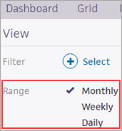
- To filter the metric by department, department specialty, provider, place of service, etc., click the plus sign
 (or the Select link) next to Filter on the left side of the page.
A window opens that displays the dimensions available for the selected metric on the left side (for example, Department, Place of Service, Provider) and the options for the dimension on the right side.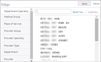
Note: The dimensions available from the Filter menu depend on the selected metric and your practice setup. - Select a dimension on the left side of the window, and then select filter options from the right side of the window. For example, if you select Provider as the dimension, you see a list of providers; select the providers from the list. Click the Select All link to select all options.
Note: Selecting one filter option displays the trend for that option; selecting multiple options allows you to compare the performance of your selected options. - Click Apply.
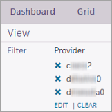
- To remove a filter, click the delete
 icon to the left of the filter.
On the Grid view
- Review the performance of your entire practice at the top of the Grid view.
- View practice by — You can select a different dimension from the menu to display the performance data by provider, place of service, provider group, and so on.
Note: You can change the default option shown in the View practice by menu on the Sentinel Metrics Dashboard Settings page. - Click an individual cell to display the Metric Detail view for that metric.
If you have access to multiple practices, you can use the Sentinel Metrics Dashboard to view:
- Aggregated performance metrics across every practice that you have user permissions for
- Detailed performance metrics for each practice
For example, if you are logged in to practice 1234, which is part of a network of six practices, you can view the performance metrics for all six practices or view the individual performance metrics of each practice.
This feature is available to all practices that have a reporting network set up.
- Display the Sentinel Metrics Dashboard: On the Main Menu, click Reports. Then click Sentinel Metrics Dashboard.
The Sentinel Metrics Dashboard displays the metrics for the single practice that you're logged in to. - To view details about all the practices in your network, click the practice ID for the top-level practice in your network.
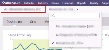
You see a summary of performance data. You can view this data by individual practice in the grid view and on the Metric Detail pages. - To view details about a different single practice, click the practice ID that you're logged in to, then select a new practice.
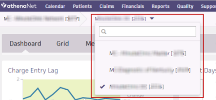
You are automatically logged out of your current practice and logged in to the selected practice in the same browser window. When you select a single practice in your network, you can view data by all available dimensions, such as provider or department.
The Sentinel Metrics Dashboard provides the following metrics. The supporting data behind each metric is refreshed on a nightly basis.
This metric shows the percentage of your lab, imaging, and consult orders that are sent to providers (people or entities) within your self-defined local networks. This metric provides information about the referral patterns across your employed and affiliated providers' continuum of care. By examining the overall metric and its order type group components, you can identify top opportunities and successes for in-network referral patterns at the provider, department, and specialty level.
Definition — Total number of lab, imaging, and consult orders sent to providers that are configured for local networks divided by the total number of lab, imaging, and consult orders sent to all providers over the same period of time.
Target — The target for this metric is 80% of orders sent within your local networks.
Shown for — athenaClinicals clients
This metric is no longer available in the Sentinel Metrics Dashboard. You can now view this metric in the Insights Dashboards. For a list of the metrics on each dashboard and their definitions, see Insights Dashboards – Metrics and Definitions on the Success Community.
This metric is no longer available in the Sentinel Metrics Dashboard. You can now view this metric in the Insights Dashboards. For a list of the metrics on each dashboard and their definitions, see Insights Dashboards – Metrics and Definitions on the Success Community.
This metric shows how many days on average it takes you to review and close open documents.
Definition — Total number of open documents, divided by the average daily inflow of new documents.
Note: DDO is not displayed by provider.
Target — The target for this metric is 2 days or less. To reach this target, examine your patient encounter and delegation workflows to identify areas for improvement.
Shown for — athenaClinicals clients
This metric shows the percentage of your patients who are fully registered with an email address, mobile phone number, and scanned insurance card on file. The information required to fully register a patient varies, depending on patient type:
- Insured — Email address, mobile phone number, eligibility confirmation from the insurance provider, and a scanned insurance card on file.
- Self Pay/Case Policy — Email address and mobile phone number.
- Interface Check-In — Eligibility confirmation from the insurance provider.
Definition — Percentage of patients for whom claims were submitted who qualify as fully registered (based on patient type).
Target — The target for this metric is 70% of patients. To reach this target, emphasize the collection of this information as an integral part of the patient check-in process. Also, encourage patients to check in for their appointments online.
Note: The PFRR metric on the Sentinel Metrics Dashboard contains a component metric that measures efficiency in scanning insurance cards. Existing athenaOne reports function similarly, but by design do not match up directly with the PFRR sentinel metric. The PFRR metric is triggered on claims-billed events, whereas the reports focus on appointment-based events, namely check-in.
Shown for — athenaCollector clients
This metric shows the percentage of your patients who have registered for a Patient Portal account.
Definition — Percentage of patients who have existing Patient Portal accounts or who signed up for an account within 30 days following their appointment. For patients with multiple appointments in the same month, only the first appointment counts toward this metric.
Target — The target for this metric is 70% of patients. To reach this target, contact your Customer Success Manager to discuss different strategies for increasing Patient Portal adoption across your patient population.
Shown for — athenaCommunicator clients
This metric shows the percentage of provider documentation time that happens after the patient encounter has ended.
Definition — Documentation time by an M.D. or midlevel provider outside the Intake, Exam, and Sign-off stages divided by the total documentation time for an encounter.
Target — The target for this metric is 20%.
Shown for — athenaClinicals clients
This metric shows the percentage of encounters that were closed on the same day that they were opened.
Definition — Number of clinical encounters that have a same-day close date, divided by the total number of checked-in appointments associated with clinical encounters where the rendering provider is a "person" provider during the reporting month.
Target — The target for this metric is 80% of encounters. To reach this target, examine your patient encounter and delegation workflows and documentation time per provider to identify areas for improvement.
Shown for — athenaClinicals clients
This metric is no longer available in the Sentinel Metrics Dashboard. You can now view this metric in the Insights Dashboards. For a list of the metrics on each dashboard and their definitions, see Insights Dashboards – Metrics and Definitions on the Success Community.
The Sentinel Metrics Dashboard displays all sentinel metrics pertinent to your practice based on your configuration and the athenahealth services that you use. When you open the Sentinel Metrics Dashboard, you can display the metrics on any of these views:
- Dashboard view
- Grid view
- Metric Detail view
The default view that appears when you open the Sentinel Metrics Dashboard is either the Dashboard view or the Grid view. You can set the default view on the Sentinel Metrics Dashboard Settings page.
On the Dashboard view of the Sentinel Metrics Dashboard, all metrics appear within a "card." Each card represents your practice-level performance with no filters or sorting applied. Each graph shows the trend for the previous 13 months.
Note: If your practice has used the athenahealth service for less than a year, the graph displays the data generated since your go-live date for the service.
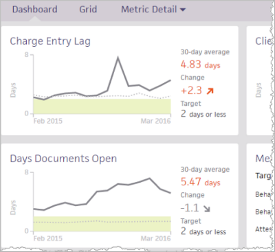
Each card displays the following information:
- Name of the metric.
- Scale measured in the unit pertinent to the metric.
- 13-month trend (solid line), which shows performance peaks and valleys over the timeline.
- 30-day average — This rolling average is refreshed each night to include the previous day's data. The 30-day average allows you to quickly identify and address possible issues. The 30-day average is color coded.
- Gray text — Performance is within the athenahealth target.
- Red text — Performance is outside the athenahealth target.
- Change — The change value (+/-) compares the most recent 30-day average to the average of the 30 days prior to that time period. The change value and trend arrow are color coded to indicate whether the change is moving in a favorable or unfavorable direction. If the arrow is red, the change is moving in the wrong direction, according to the definition of the metric. Depending on the metric, an up arrow can be good or bad, as can a down arrow
- Best Practice — Represents the athenahealth recommendation for high-performing practices, indicated by the green area on the metric card. The best practice target also appears on the right side of each card.
Note: This best practice target is athenaNetwork wide. It is neither segment nor specialty specific. Unlike the benchmark, the best practice target is not recalculated.
On the Dashboard view, you can click individual metric cards to display the Metric Detail view for each metric.
On the Grid view of the Sentinel Metrics Dashboard, you can make direct comparisons on a single page.
- You can review practice-level performance across sentinel metrics.
- You can break down the data along dimensions that make the most sense for your practice.
The top of the Grid view shows your practice-level performance. You can also see numerical values for the 75th percentile performance of athenaOne practices that most closely resemble your practice.
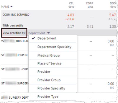
Below the practice-level performance data, you can use the View practice by menu to break down the data along several dimensions, including custom filters that you configure. This breakdown allows you to understand the sentinel metric performance of similar business units and potentially share knowledge and best practices across your organization to optimize performance throughout.
You can click individual table cells to display the Metric Detail view for the selected metric, with a filter applied for the business unit that you selected.
Note: Certain metrics do not appear in the Grid view when certain dimensions are selected. When you select a dimension that is not supported by a metric, a message appears. You can still see all other metrics that do have data that supports your selected dimension.
A business unit is an individual entry for a given dimension. For example, if you select Department as the dimension, the Main Street Office could be a business unit. For each business unit, you see performance for all relevant metrics. If the business unit does not have data to support a certain metric, a double dash (--) appears in that cell.
Each cell displays the actual metric value.
- A value in red indicates that the performance for that metric is outside the athenahealth best practice target.
- The change value (+/-) and the trend arrow are color coded to indicate whether the change is moving in a favorable or unfavorable direction. If the arrow is red, the change is moving in the wrong direction, according to the definition of the metric. Depending on the metric, an up arrow can be good or bad, as can a down arrow.
Click individual cells to display the Metric Detail view for the selected metric.
The Metric Detail view for each metric provides additional options for viewing the performance data. The unfiltered metric visualization shows the 13-month trend for the selected metric. You can hover the cursor over points on the line graph to display performance information at that point in time. The current month is a month-to-date value.
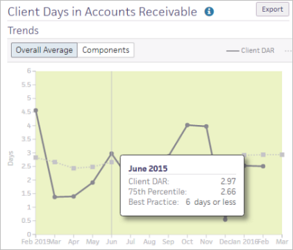
Note: At the top of the Metric Detail view, you can click the information icon ![]() to the right of the metric name to display the definition of the metric.
to the right of the metric name to display the definition of the metric.
Date ranges
On the left side of the Metric Detail view, you can select Daily, Weekly, or Monthly using the Range option (Monthly is the default option).

The Monthly option displays a 13-month trend on the chart with metric values on the right of the chart in rolling 30-day increments. The Daily option displays a daily trend over the last 30 days. The Weekly option displays a weekly trend over the last 13 weeks.
Filter options
On the left side of the Metric Detail view, you can select filter options by clicking the plus sign ![]() (or the Select link) next to Filter.
(or the Select link) next to Filter.
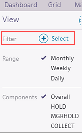
A window opens that displays the dimensions available for the selected metric on the left side (for example, Department, Place of Service, Provider) and the options for the dimension on the right side.

Note: The dimensions available from the Filter menu depend on the selected metric and your practice setup.
Select a dimension on the left side of the window, and then select filter options from the right side of the window. For example, if you select Provider as the dimension, you select the providers from the list.
Note: Selecting one filter option displays the trend for that option; selecting multiple options allows you to compare the performance of your selected options.
Chart data
On the right side of the Metric Detail view, you can see the 30-day average, change value, 75th percentile benchmark, and target data, along with the relevant monetary value for these metrics: client days in accounts receivable (CDAR) and time of service collection rate (TSCR).
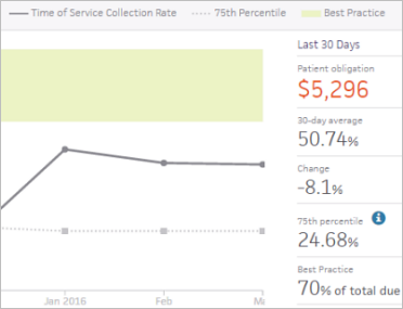
Note: You can click the information icon ![]() next to 75th percentile to display information about how this percentile is calculated.
next to 75th percentile to display information about how this percentile is calculated.
Additional resources
At the bottom of the Metric Detail view, you can find links to additional resources to learn more about the sentinel metric.
Export metric data to a table
You can click the Export button at the top right of the page to download the data as a .csv file that you can open in Microsoft Excel. The exported data retains any filters applied to the data and the selected view of the data.
The Impact Ranking appears below the graph on the Metric Detail view. Impact Ranking can help you quickly identify your top successes and top opportunities with performance against certain metrics. With the data shown in the Impact Ranking, you can see potential breakdowns in operations and introduce best practices where necessary.
Note: You can click the information icon ![]() next to Impact Ranking to display information about how this ranking is calculated.
next to Impact Ranking to display information about how this ranking is calculated.
You can view the Impact Ranking by the dimensions available on the dashboard (the dimensions that you can select depend on the selected metric). The Impact Ranking highlights the contrast between good and poor performers in your practice.
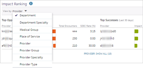
For example, you can view the same day encounter close rate metric by Provider Specialty to see how providers in that specialty are performing against this metric. If some providers in the same specialty are performing more efficiently than others, you can connect the providers with one another to facilitate sharing of best practices.
To calculate the Impact Ranking of a metric, athenaOne takes individuals within a selected dimension, such as providers, and calculates the difference between the individual and the overall practice average on a metric.
The formula for this calculation is
((Context Rate x Unit Denominator) — Unit Numerator)/Context Denominator)
For each metric, the Impact Ranking defaults to the most relevant dimension. For example, the time of service collection rate (TSCR) metric defaults to the Department dimension. If you select an individual department, you can see the users who collect patient payments in that location and how efficiently they do so. The other sentinel metrics follow a similar approach.
The following table lists the default Impact Ranking dimension and the default breakout dimension (the breakout dimension is displayed when you click a data point).
Note: Some metrics, for example, days documents open (DDO), have no breakout dimension due to limitations in how we calculate the metric. DDO, for example, cannot be calculated by Provider, so Provider-based dimensions are not supported in the Impact Ranking for that metric.
| Sentinel Metric | Default Impact Ranking Dimension |
Default Breakout Dimension |
|---|---|---|
| Care coordination rate | Provider | None |
| Charge entry lag | Department | Provider |
| Client days in accounts receivable | Department | Provider |
| Days documents open | Department | None |
| Patient full registration rate | Department | User |
| Portal adoption rate | Department | User |
| Post-Visit Documentation Rate | Provider | None |
| Same day encounter close rate | Provider | None |
| Time of service collection rate | Department | User |
Component metrics display the breakdown of the top-level metric. For example, client days in accounts receivable (CDAR) represents your practice's performance working claims in all of these statuses: HOLD, MGRHOLD, and COLLECT. In contrast, the CDAR component metrics display your practice's performance working claims in those three statuses individually, which can help you narrow down potential issues.
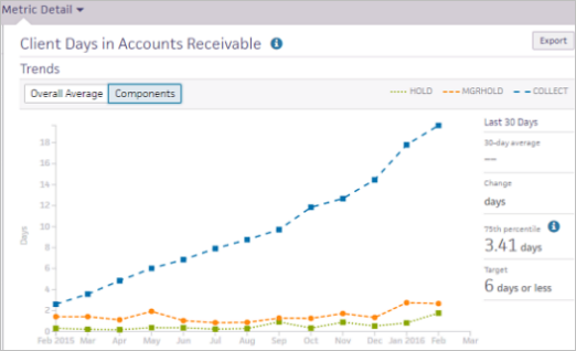
The following top-level metrics have component metrics:
- Care coordination rate (CCR)
- Client days in accounts receivable (CDAR)
- Patient full registration rate (PFRR)
- Time of service collection rate (TSCR)
The components for these sentinel metrics are listed on the left side of the Metric Detail view (the following figure shows PFRR).
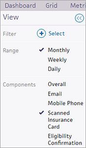
To display all individual component metrics in the graph, click the Components button in the Metric Detail view. To display the overall view of the metric, click the Overall Average button.
You can use custom filters to filter the information available on the Sentinel Metrics Dashboard. For example, you can use custom filters as follows:
- Create a custom filter that represents a business hierarchy and separates providers into categories such as regions, so that you can view metrics by groups specific to your practice.
- Create a custom filter that represents regional directors so that you can map departments or providers to named regional directors and view their performance in the grid view. You can then connect high-performing directors with lower-performing directors to share knowledge and best practices, so that optimal performance can be achieved across the entire organization.
For information about creating custom filters, see the Custom Filters page.
You can use the following reports to obtain detailed information about certain sentinel metrics.
The Charge Entry Lag report helps you to understand the charge entry lag (CEL) sentinel metric on the Sentinel Metrics Dashboard. This report is located on the Front Office Operations tab of the Report Library.
Note: You must have permission to access the Report Library.
The Charge Entry Lag report provides the following information:
- Claim ID
- Service Date
- Charge Entry Date
- Elapsed Days
- Check Out Name
- Supervising Provider Name
- Department
- Place of Service
This report is built using the Claim report type in Report Builder. When you select this report on the Front Office tab of the Report Library, the Report Builder appears with the display columns preselected. You can edit the display columns and filters to customize the report before you run it.
The Portal Adoption Rate — Sentinel Metrics Dashboard Report helps you to understand the Portal adoption rate sentinel metric on the Sentinel Metrics Dashboard. This report is located on the Communicator tab of the Report Library.
Note: You must have permission to access the Report Library and the Report Builder.
The Portal Adoption Rate — Sentinel Metrics Dashboard Report shows results for the 30 days prior to the date that you run the report. The report includes the following information:
- Percentage and number of patients who accepted the Patient Portal Terms and Conditions within 30 days of their appointment.
Note: For patients with multiple appointments in the same month, only the first appointment counts towards this metric. - Percentage and number of email addresses collected from patients over the last 30 days.
The Portal Adoption Rate report in the Report Library uses the same display columns listed in the "Portal adoption rate reporting" section on this page.
The Time of Service Collections report helps you understand the financial status of every appointment and observe the data displayed in the time of service collection rate (TSCR) metric on the Sentinel Metrics Dashboard. athenahealth recommends that you use the Time of Service Collections report to monitor performance over time at the practice, department, and staff level.
The Report Builder includes display columns and filters that you can use to report on the data shown on the Sentinel Metrics Dashboard.
Note: To access the Report Builder, you must have the Report Builder user permission (included in the Practice Superuser role).
The Claim report type in Report Builder provides the following display columns, which you can use to report in greater detail on the charge entry lag metric that appears on the Sentinel Metrics Dashboard.
On the Choose Display Columns tab for the Claim report type, you can select the following display columns.
Appointment
- Appointment Checked Out By
- Appointment ID
- Appointment Type
Location
- Service Department Specialty
Transaction
- Charge Entry Date
- Charge ID
- Charge Service Date
Measures
- Average Charge Entry Lag (#)
- Count of Non-voided Claims (#)
Note: If you have saved or scheduled reports that include the Count of Claims (#) column, you may want to update your existing reports - Sum of Charge Entry Lag (#)
The Appointment report type in Report Builder provides the following display columns, which you can use to report in greater detail on the Portal adoption rate metric that appears on the Sentinel Metrics Dashboard.
Note: You can also report on this information using the Portal Adoption Rate — Sentinel Metrics Dashboard Report located on the Communicator tab of the Report Library.
On the Choose Display Columns tab for the Appointment report type, you can select the following display columns to run reports relevant to the Portal adoption rate metric on the Sentinel Metrics Dashboard.
Appointment
- Appointment Checked In By
- Appointment Checked Out By
- Appointment Scheduled By
Location
- Service Department Communicator Brand
Patient
- Patient Portal Adoption Method
Measures
- Count of Emails Collected (#)
- Count of New Email Opportunities (#)
- Count of New Email Opportunities Collected (#)
- Count of Portal Accounts (#)
- Count of Portal Opportunities (#)
- Count of Portal Opportunities Converted (#)
- Count of Portal Patients (#)
- Email Collection Rate (%)
- Email Opportunity Collection Rate (%)
- Portal Adoption Rate (%)
- Portal Opportunity Conversion Rate (%)